Media & Branding Guideline
Attribution
All content published by OtterClam is owned by various rights holders. Any data associated with OtterClam shall always be accompanied by the OtterClam brand. In partner integrations, the full logo (icon + wordmark) must always be used. An icon may be used instead under certain conditions as stated below.

The OtterClam Logo
The OtterClam logo was created by a passionate founding Otter. It is crucial that the logo is always applied with respect to these guidelines.
🎨 Download Logo Assets Here:
{% file src="./img/OtterClam Logo.zip" %}
Primary Logo
OtterClam’s primary logo is a horizontally placed icon+wordmark. This shall be used across primary brand applications.
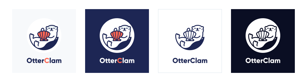
Secondary Logo
OtterClam’s secondary logo is a vertically placed icon+wordmark. It may be used instead of the primary logo if it better suits the associated media. However, it should never be placed directly next to the primary logo.
OtterClam Icon
As mentioned above, the full logo must be used unless the conditions permitting the usage of an icon alone applies. The conditions are as follows:
- The OtterClam name has been displayed in plain text, and
- There is not enough space for the full logo
It is important to note that the icon may be displayed without the wordmark; but the wordmark may never be displayed without the icon.

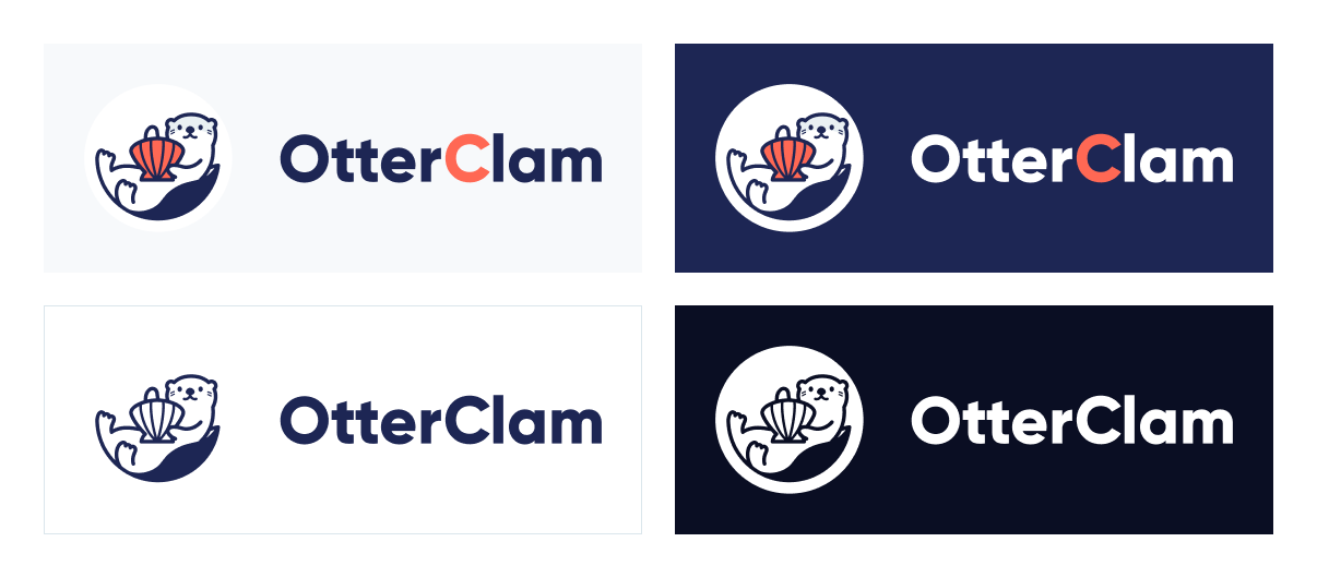
Logo Color Variants
The proper color variant to be used depends on the background of the medium. The logo with wordmark in Otter-Black should only be used on a white or light background. The logo with wordmark in white should only be used on a black or dark background. You can use a monochrome logo if the colored one does not fit in the place you apply to.
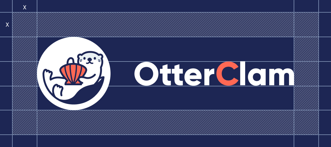
Exclusion zone
The logo and the icon’s exclusion zone is ⅓ the height of the icon (marked as × in the diagram).
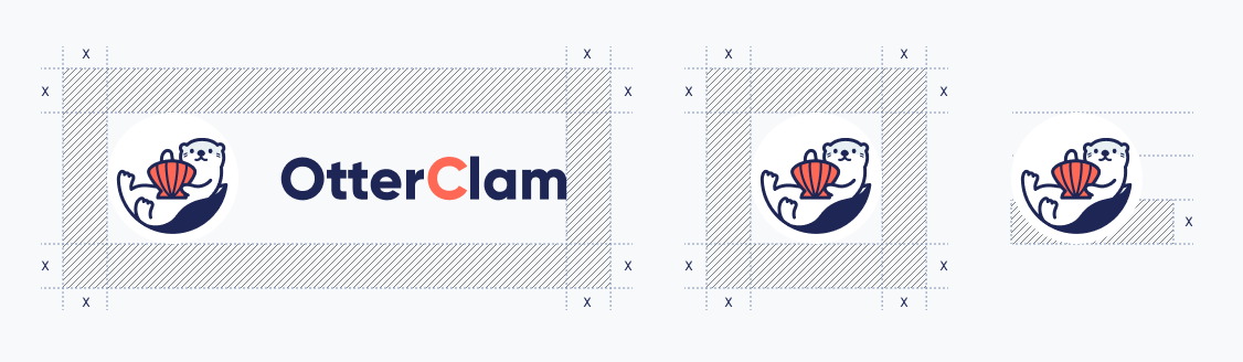
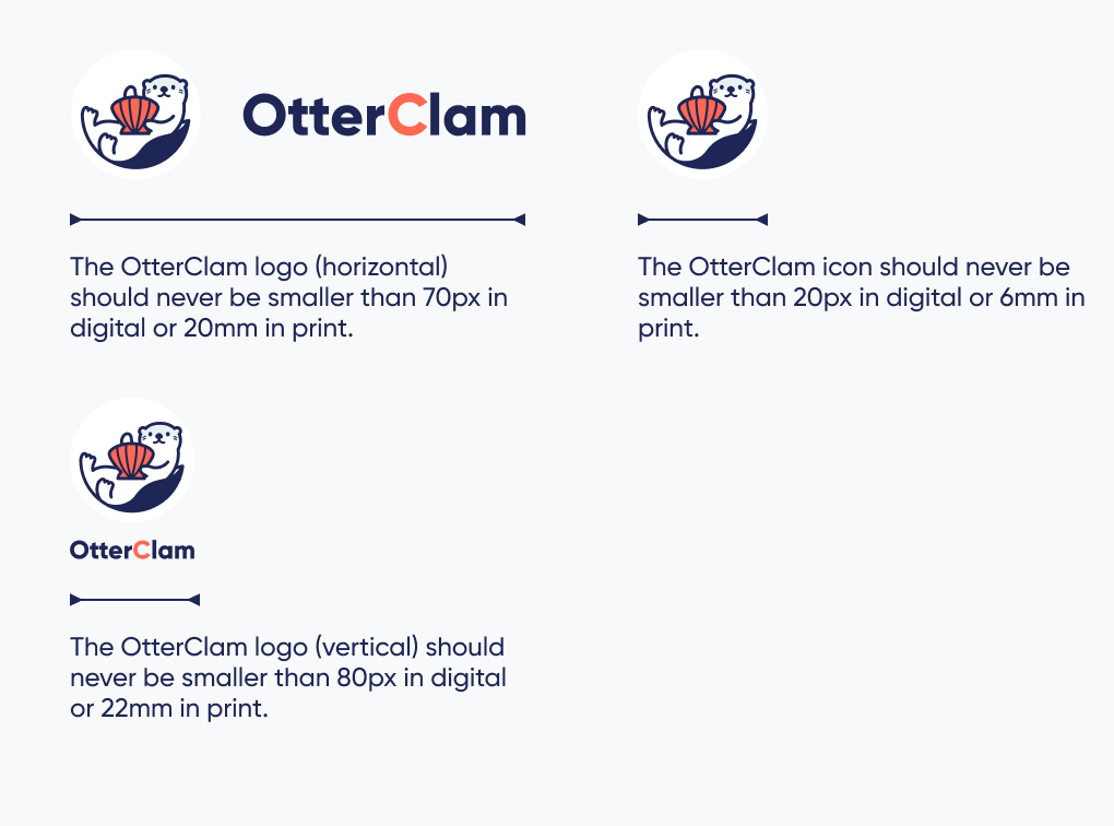
Minimum size
To ensure legibility, an OtterClam logo must be applied at a minimum size as indicated below.
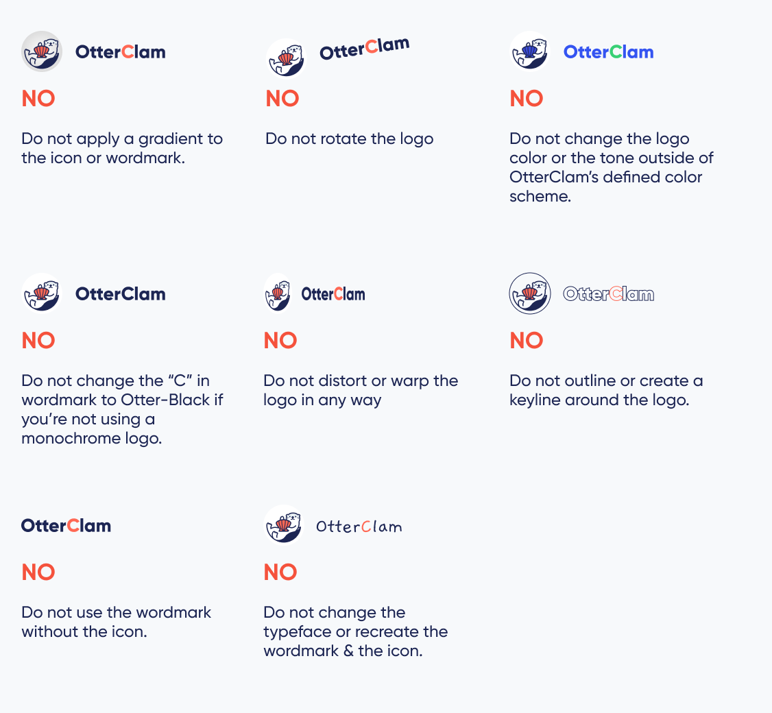
Logo misuse
The appearance of the logo must be consistent. Hence, it must not be misinterpreted or modified in any way. The applications of the logo must remain consistent with the guidelines. There are no exceptions.
Tokens of OtterClam
The following guidelines must be complied with upon usage of token icons provided by OtterClam.
🎨 Download Token Assets Here:
{% file src="./img/OtterClam Token.zip" %}
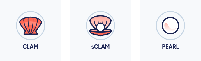
CLAM token
The CLAM token icon depicts a clam from the frontal plane. Using the token icon must always include the clam and the gray circle.
sCLAM token
The sCLAM token icon depicts an opened clam from the dorsal plane, with a pearl in it. Using this icon must always include the opened clam, the pearl, and the gray circle.
PEARL token
The PEARL token icon is depicts a pearl. Using this token icon must always include the pearl and the gray circle.
OtterClam’s Colors
Color is an integral part of brand identity. Consistent use of the color palette will not only reinforce the cohesiveness of the brand, but also communicate a certain branding position to the users.
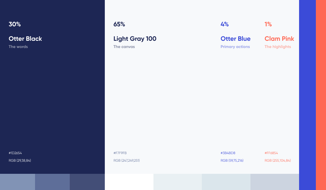
Most of the colors used are Otter Black and Light Gray 100.
Otter Blue and Clam Pink can be used as highlights, but both of them should not occupy more than 4% and 1% in the canvas.
Logos and naming restrictions
The logos of other organizations shall not include, or look similar to OtterClam’s logo or any of its brand elements (e.g. the clam, the otter, and the pearl). It is prohibited to incorporate OtterClam’s trademarks, in whole or in part, in the name of another organization’s product, application, service, or website.
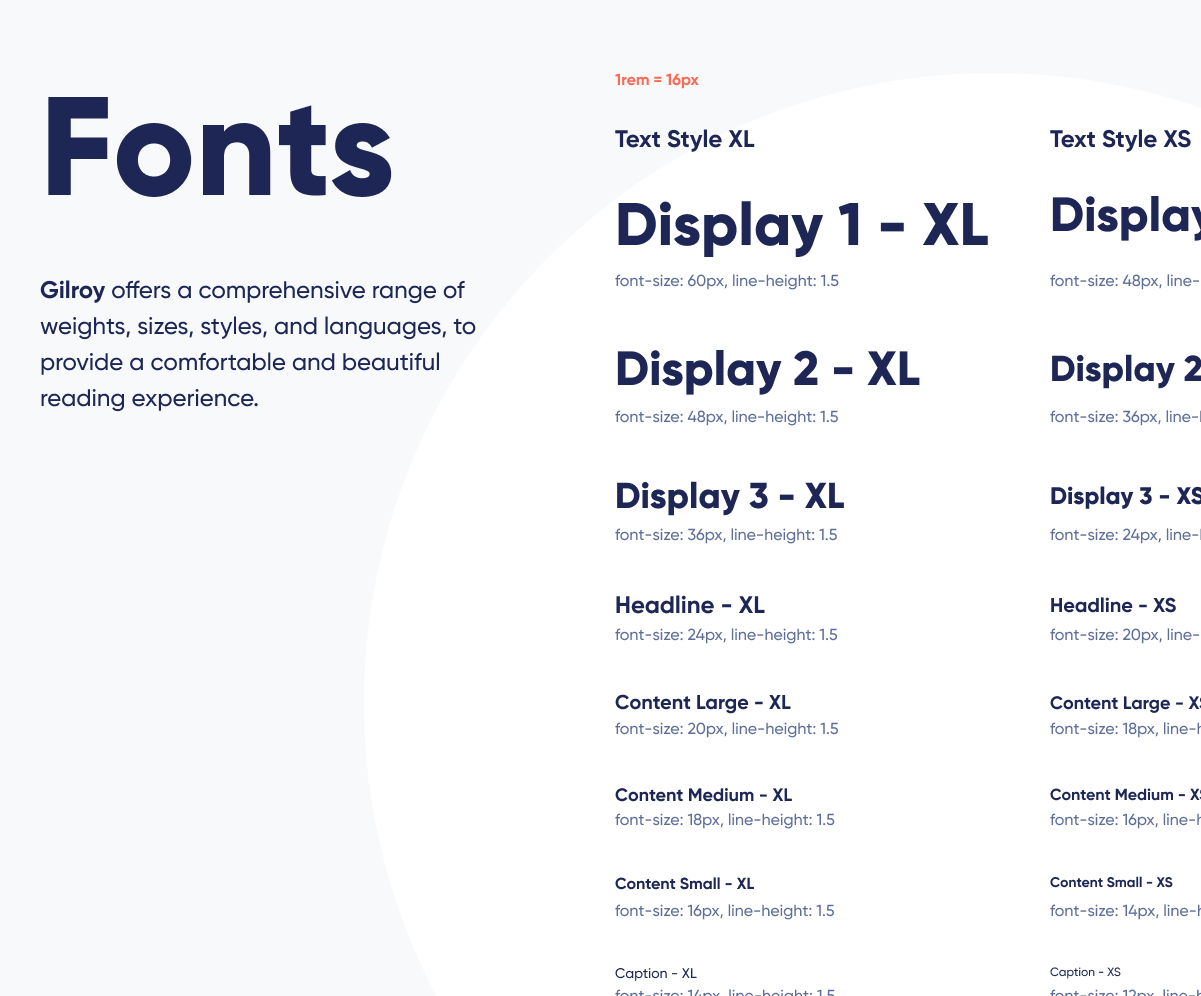
Fonts
The font Gilroy is used in the OtterClam logo and all related branding materials.
Thank you!
If you are having trouble with anything in this guide or unsure about which approach best represents the OtterClam brand, please contact the OtterClam design team at Discord.